
NOVEMBER 30, 2006 at 12:08 PM
Posted by GERI
Source: Daily Mail via Wizard News
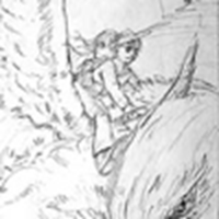
A sketch of the cover that was never used for the Harry Potter and the Prisoner of Azkaban book by Cliff Wright is scheduled to go on sale this weekend for £8,500. Mr. Wright, who had input from JK in reference to the image of the hippogriff, was somewhat disappointed that this version of the cover didn’t make publication.
According to the article
:
The sketch shows Harry and his friend Hermione Granger on a hippogriff, a cross between a horse, lion and eagle. Mr. Wright said: "In some ways I prefer the sketch to what ended up on the cover. It's more dynamic: in the final version, the hippogriff is not moving quite so fast. JK Rowling herself faxed over an image of what she thought the hippogriff should look like."
Reader Comments (164)
Your Thoughts
click to write...
Copyright © 2002-2009 HPANA. This work is licensed under a Creative Commons License. ![]()
HPANA is an unofficial fan site, in no way affiliated with J.K. Rowling,
Scholastic Books, Bloomsbury Publishing or Warner Bros. Entertainment. All
trademarks and copyrighted material are the property of their respective owners.
About HPANA | Movie 6 | Send a news tip | Contact us | Privacy policy
Auror
Points: 2363
Nataly says:
A sketch of the cover? hm...intresting it will be nice!
Posted Nov 30, 2006 at 1:37 PM EST
Order of Merlin, 1st Class
Points: 1922
emma_wannabe says:
Hey, that is REALLY cool!
-iSaBeL
Posted Nov 30, 2006 at 1:48 PM EST
Order of Merlin, 2nd Class
Points: 1789
Veela~Girl says:
It is quoite similar, but I agree with Jo. This one shows a faster flight, it's more of an actions shot than the other I think. Possibly they were just too similar to validate a change in the illustrator (it is one woman who did all of the covers thus far isn't it?)
Posted Nov 30, 2006 at 1:56 PM EST
Witch
Points: 701
Kelly Ann Snape says:
Cool, I love how the Hypogriff's head is so close ... almost as if it were coming out of the page. It would have been a great cover and I am sad that it did not make it too. Oh well at least we get to see it now. I am going to add it to my library.
Posted Nov 30, 2006 at 2:05 PM EST
Order of Merlin, 3rd Class
Points: 1563
BlueIstari says:
its pretty cool, not much different from the actual cover though, they're both picture of harry and hermione riding on buckbeak. I think buckbeak looks better in the sketch though.
Posted Nov 30, 2006 at 2:06 PM EST
Head Girl
Points: 427
shadowquill says:
Wow! Yeah, it definetly is more dynamic. As an artist myself (not nearly as good as THIS, but an artist nonetheless), I really agree that this looks really awesome, and I wish I could illustrate such movement myself! (I'm fairly good at realism, but depicting movement is still beyond my grasp.) Gorgeous sketch. I want one! ;)
Posted Nov 30, 2006 at 2:30 PM EST
Order of Merlin, 2nd Class
Points: 1600
jenn007a says:
Wow thats really cool! But i like the covers that are on the U.S. editions.
Posted Nov 30, 2006 at 2:45 PM EST
Order of Merlin, 1st Class
Points: 1857
Lily Gymreig says:
I quite like that one actually - it's a shame it wasn't used on the cover for any of the versions (be they international or otherwise)
Posted Nov 30, 2006 at 2:47 PM EST
Auror
Points: 3656
Anastasia Popovick says:
Wow! That's really cool! Wouldn't it be great to own something like that? Alas, my budget won't allow for such wonderful possessions! Maybe someday...
Posted Nov 30, 2006 at 2:47 PM EST
Muggle
Points: 20
Benjamin Potter says:
I like the one that ended up on the cover better than this one. The covers to the books all showcase Harry. The one on the real cover showcases Harry more than this one.
Posted Nov 30, 2006 at 2:50 PM EST
Muggle
Points: 20
Benjamin Potter says:
FYI: When I talk about the covers I mean the U.S. edions.
Posted Nov 30, 2006 at 2:52 PM EST
Order of Merlin, 3rd Class
Points: 1454
musician says:
To clarify some things, because some people don't seem to get it, this was intended for the British addition, and the guy who drew it actually did draw the one that is on the book aswell...
I think the signature would have been added now, for the purpose of selling it, thus it says 06, because he couldn't just put his name on it back then when it might have ended up on the cover, they wouldn't have wanted his name in the corner...
Also, for people who want to see it bigger, if you follow the link to the article, and just click on the picture, it will enlarge...
Finally, as I too am an artist and illustrator, I agree with shadowquill, it does have more movement, it has a bit more action if you know what I mean, the way Buckbeak is turning his head towards us... So I like the way he is drawn better, but would probably do Harry and Hermione a bit more like they are on the picture on the cover... Of course he would have corrected their expressions a bit maybe, in finishing it, adding the colour and all...
It's cool that it is more of a close-up...
Posted Nov 30, 2006 at 2:53 PM EST
Order of Merlin, 3rd Class
Points: 1412
Chelsea_Weasley says:
Wow.... That's pretty cool. I am glad they let us see what could have been. Awesome!
Posted Nov 30, 2006 at 3:00 PM EST
Witch
Points: 603
Book-worm says:
Cool. But I wish we had a bigger picture but I guess they cant as people would print it off. Then what would be the point of selling it. Still wish we had the big picture do...
Posted Nov 30, 2006 at 3:13 PM EST
Professor
Points: 1023
Magical Teapot says:
I guess I'd need a bigger piggy bank if I wanted it...
It must be pretty cool but I'd like a bigger picture.
Posted Nov 30, 2006 at 3:20 PM EST
Witch
Points: 930
lemonlime says:
Ooh, I like it! Although I wish Ron was also on the cover, so that the entire trio would be included. It would be neat to own it, but, alas, I have not the money.
Posted Nov 30, 2006 at 3:39 PM EST
Witch
Points: 593
Tenth Weasley says:
Wow - I love this sketch. It's a shame it didn't get used for the book. If I had the cash, I'd buy this!
Posted Nov 30, 2006 at 3:40 PM EST
Points: 217
skates says:
Wow! that is an impressive scetch!! I actually love all the covers of the HP books....none of them are freaky looking like some of the others where Harry's nose is two feet long....
Posted Nov 30, 2006 at 3:43 PM EST
Points: 217
skates says:
oops I spelled sketch with a c.....gosh I'm stupid sometimes....
Posted Nov 30, 2006 at 3:45 PM EST
Order of Merlin, 2nd Class
Points: 1675
lissir10 says:
Thats pretty cool!!
I think that would have been
better than the cover that was
put... It looks more like Buckbeak!!
Posted Nov 30, 2006 at 3:49 PM EST
Student
Points: 284
CharlieChop8 says:
Wow! I have to say that i prefer this sketch to the final one too! Wright is an amazing artist. Its a shame that i dont have a spare $16000 lying in my bank account... Ah well. Well done to the person who buys it!
Posted Nov 30, 2006 at 3:50 PM EST
Professor
Points: 1041
*Peeves12 says:
This sketch is kinda more exciting than the one they used. This one's more in you face, because of the hippogriff's head sticking out of the corner. Its cool.
Posted Nov 30, 2006 at 3:56 PM EST
I Am Queen of My Castle
Points: 3673
Hecate3fold says:
What can I say, it must be nice to be able to afford something that expensive. Way out of my league, but I guess I can dream with all of the rest. Blessings! Hecate3fold!
Posted Nov 30, 2006 at 3:57 PM EST
Points: 8027
deemz says:
Nice, but i think the one on the cover is better :P
Posted Nov 30, 2006 at 3:59 PM EST
Witch
Points: 940
witch_pirate says:
Thats a really cool picture! Its done well too 5 digits wow!! thats a lot of money.
Posted Nov 30, 2006 at 4:07 PM EST
Witch
Points: 692
~Remember Snape~ says:
I really like thae drawing it is really good. I think that would have made a great cover.
Posted Nov 30, 2006 at 4:09 PM EST
Back to top of page